Phantom Object
The Phantom object allows extra spacing, horizontal, vertical, or both, to be added or suppressed during layout for enhanced appearance.
In the following example, the two radicals are unbalanced: ![]() . For enhanced typography, the radical bars and bottom points should line up. To accomplish this, the user should adjust the height of the second radical, to make it the height of the fraction. However, no extra padding should be added to the width. The user can accomplish this by inserting a phantom of the fraction under the second radical, as in:
. For enhanced typography, the radical bars and bottom points should line up. To accomplish this, the user should adjust the height of the second radical, to make it the height of the fraction. However, no extra padding should be added to the width. The user can accomplish this by inserting a phantom of the fraction under the second radical, as in: ![]() . In this case, the radicals line up, and the phantom fraction acts as ghost text that adds vertical space but no width (
. In this case, the radicals line up, and the phantom fraction acts as ghost text that adds vertical space but no width (<zeroWid>). The phantom can also be used to add horizontal space, alone or in conjunction with vertical space.
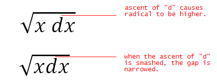
Phantoms are not always invisible. The "smash" is a type of phantom in which the content remains visible. However, part or all of the smash can be ignored during layout of text around it. For example, examine the following two radicals:

A discerning typographer might desire less vertical spacing between the tip of the "d" and the radical bar in the first example. By placing the differential in a smash and assigning it zero height (<zeroAsc>), the spacing is reduced.
Note that in this same example, when the differential term is placed inside a phantom, the spacing between the first and second characters changes. Again, the discerning typographer wishes that despite the presence of the phantom, differential spacing is retained. By assigning the phantom transparency for spacing (<transp>), proper spacing is preserved.
Finally, <zeroDesc >phantom allows the descent of the phantom base to be ignored during layout. The following example illustrates the usage of <zeroDesc>:

Each of the phantom properties can be applied whether the phantom is visible or hidden (the <show> property).