Setting Up the Text Area
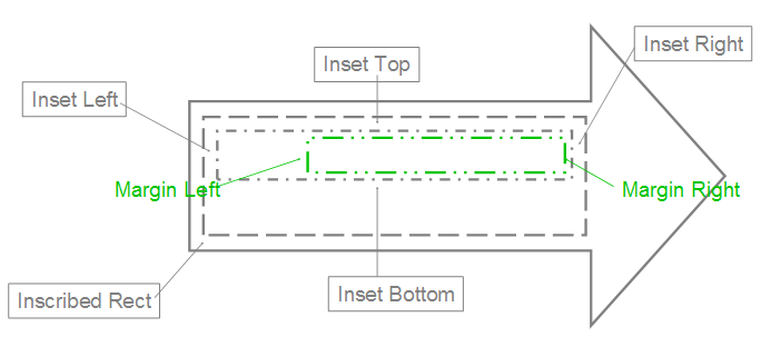
Let's start with how a text area might be initially described. This area is the container within which all the child text for this body resides. First, it is useful to understand the inset properties; specifically, the top, bottom, left and right inset properties that are also known as internal margins for the text body. The anchor attribute allows us to specify where the text area should be anchored within its bounding rectangle.
An illustration of this bounding rectangle is highlighted below by the inner green box. Notice here that the bounding rectangle is anchored to the right.

Here's how the text will appear inside. Attribute @AutoFit allows for three basic scenarios:
No AutoFit: The text is allowed to flow outside the container.
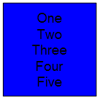
Normal AutoFit: The text is resized using defined constraints to fit inside the container area. (This is used when the text is too large or long to fit in the text container.)
Shape AutoFit: The actual text container is resized to contain all the text. (This is the only option that can cause the container to have its dimensions changed.)
The term flow is used to describe the way in which text moves around inside this text area, and to describe how each of the body properties affects the text within the text area.
One way that text can flow is from one line to the next. This can be done automatically by using the text-wrapping attribute. Another way is to use columns. The XML framework allows for the specification of a number of columns into which the text is to be automatically broken. This feature also allows for the specifying of the spacing of columns and a right-to-left layout instead of the default left-to-right. Another way that text can flow is vertical instead of horizontal. For this, there are many different types of vertical text that can be described: from text that appears rotated to text where the characters are truly stacked. The text can even be made to flow differently when an East Asian font is specified.
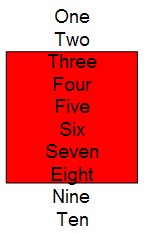
When looking at the flow it is useful to discuss the potential for overflow. That is, the text must flow outside the text area because it is too large to fit inside. For this, there are two common types: vertical and horizontal. The vertical overflow can be handled in three ways:
overflow: This allows the text to flow outside the text area.

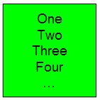
ellipsis: This crops the text that overflows and adds "…" to denote that there is hidden text.

clip: This crops the text just as ellipsis but does not insert "…", so the user has no indication that there is hidden text.
 Horizontal overflow works exactly like vertical, but with only two options: overflow and clip, which both operate as described above.